

By Sonny Day
In 2026, a desktop-centric website is a liability. With over 65% of traffic occurring on handheld devices, businesses using “responsive” patches instead of a true mobile-first user experience are seeing 50% lower conversion rates. To capture modern leads and satisfy AI search filters, your site must be built for thumb-navigation and instant mobile rendering.
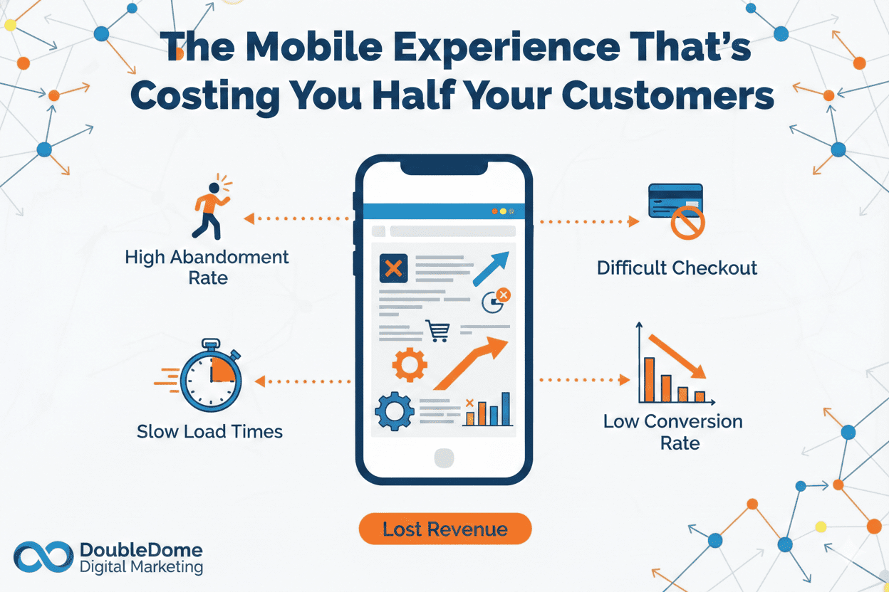
The Desktop Delusion: Why Your “Beautiful” Site is Bleeding Cash
You sit at your desk, open your company website on a 27-inch monitor, and everything looks perfect. The high-resolution video plays smoothly, the navigation is expansive, and the brand looks prestigious. You feel confident in your $15k monthly marketing spend.
But your customers aren’t sitting at desks. They are in the back of Ubers, standing in line for coffee, or multi-tasking between meetings—accessing your brand on a six-inch screen with a patchy 5G connection.
If your website was designed for a mouse and keyboard and then “shrunk” to fit a phone, you aren’t providing a service; you’re creating an obstacle course. Tiny buttons, unreadable text, and broken layouts are more than just “annoyances”—they are direct revenue killers. In 2026, the gap between a desktop-first site and a true mobile-first user experience is the difference between scaling your system and funding your competitor’s growth.
The Reverse Design Trap
Most agencies are still stuck in 2022. They design a “master” desktop version and then use code to hide or stack elements for mobile. This “Responsive-After-The-Fact” approach is fundamentally broken. It results in bloated page weights that frustrate users and “Layout Shifts” that cause Google and AI search engines to flag your site as low-quality.
When you design for mobile-first, you prioritize the “Thumb Zone”—the areas of the screen a user can naturally reach with one hand. You strip away the fluff and focus on the high-intent actions that drive revenue. By the time that mobile-optimized core reaches the desktop, it remains lean, fast, and incredibly effective.
Why AI Answer Engines Care About Your Mobile Layout
As a CEO, you want your business to be the “Preferred Answer” for ChatGPT and Google Gemini. These AI tools don’t just read your text; they evaluate your “Core Web Vitals.”
If an AI bot detects that your mobile layout is frustrating for users, it will stop recommending you. Why? Because the AI’s reputation depends on providing helpful answers. If it sends a user to a site where they can’t find the “Buy” button or read the service description, the AI has failed. A superior mobile-first user experience is now a prerequisite for being cited as a top authority in generative search results.
Desktop-First vs. Mobile-First: The Revenue Impact
| Feature | Desktop-First (Legacy) | Mobile-First (2026 Standard) |
| Navigation | Multi-level hover menus | Thumb-friendly “Hamburger” & Sticky CTA |
| Load Speed | 4.5+ Seconds (Bloated assets) | <1.5 Seconds (Optimized/Lazy-loaded) |
| User Intent | Information browsing | Immediate problem solving / Action |
| Conversion Rate | High on Desktop / Low on Mobile | High across all devices |
| AI Preference | Often ignored due to UX friction | High Priority / Preferred citation source |
Ownership of the Lead Flow: No More Guesswork
You’ve heard the jargon about “algorithm updates” long enough. At the end of the day, you want a dashboard that shows: “I spent $X, and I made $Y.” If your mobile conversion rate is half of your desktop rate, you are effectively throwing 50% of your ad spend into a black hole. Bots and accidental clicks might inflate your “traffic,” but they don’t buy services. By rebuilding your digital presence with a mobile-first user experience, you ensure that every click from a high-intent buyer has a frictionless path to conversion.
You stop renting growth from platforms that penalize you for slow load times and start owning a brand that people—and AI—actually recognize as the obvious choice.
FAQ: Fixing Your Mobile Friction
What is the “Thumb Zone” in mobile design?
The “Thumb Zone” is the area of a smartphone screen that is most easily reachable with a user’s thumb when holding the phone with one hand. High-intent buttons (like “Call Now” or “Book Audit”) must be placed here for maximum conversion.
How does mobile speed affect my AI rankings?
AI models and search engines use mobile-first indexing. If your mobile site is slow or has “Cumulative Layout Shift” (elements jumping around), AI engines will downgrade your authority and stop recommending you in answers.
Can I just use a “Responsive” plugin to fix my site?
No. A plugin merely “squishes” desktop content. A true mobile-first user experience requires a strategic redesign of the navigation, content hierarchy, and technical architecture to favor small-screen users.
Stop Losing Leads to Small-Screen Friction
In 2026, you don’t need more traffic—you need more customers. If your mobile experience is costing you leads, you’re losing more than just money; you’re losing market share to competitors who are easier to do business with.
At DoubleDome Digital Marketing, we act as the technical backbone of your team. We don’t do “fluff” or jargon; we build systems that work while you sleep. We design mobile-first because that’s where your customers are. Let’s turn your website into a high-performance growth engine that delivers clear, honest data and high-quality leads.
Is your mobile site costing you half your business?
Book Your Mobile-First Performance Audit with DoubleDome Today.