

By Jim Clanin
Good website design is all about user-experience, and it just so happens that many of the things recommended for good user experience are also great for SEO. Here are 6 tips to improve your website navigation, and with it, your website optimization.
1. Put Your Navigation in the Right Location
Web users are used to seeing the navigation bar horizontally along the top or, increasingly, vertically on the upper left side of their screen. Putting it elsewhere is confusing for visitors to your site. Yes, you want your web design to be unique and attention grabbing, but we recommend doing that with elements other than your navigation.
2. Use Specific Labels
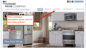
Because virtually every business can put their offerings under a label titled “Services” or “Products,” these labels do little to communicate your actual offerings or differentiate you when search engines crawl your site. Take Howard Payne Company as an example; their customers aren’t searching for the word “Products,” so including the navigation label “Kitchens” helps with their website optimization.
3. Give Fewer Options
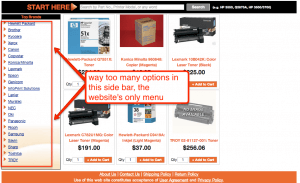
Web users will be overwhelmed by dozens of links on your home page, but they may be just as overwhelmed by as many as eight links. Research has shown that our short-term memory has enough room for seven items. That means that the fewer navigation options you offer, the more they’ll stand out.
4. Get the Order Right
The first and last items in any list are the ones most likely to stick in our memory, so make sure you’re organizing your navigation items with this in mind. Your least important items should be listed in the middle. Additionally, users expect to find the “Contact Us” link on the end of your list, the standard location in any web design.
5. Text Links, Not Graphic Buttons
Search engines can’t crawl graphic-based button navigation, so you’ll get no SEO bonus by using them. They also load slowly and are harder to edit when necessary. For good website navigation, always opt for text-based links in your navigation.
6. No Drop Down Menus
People just don’t like them. By the time a user has moved their mouse to a navigation item, they’ve already decided to click on it. When a drop-down menu appears, it creates a mental stop, as the user suddenly has to choose from more options. On top of that, drop-down menus are bad for website optimization. They can be difficult for search engines to crawl, and they encourage users to skip your higher-level navigation pages.
What are some of the common web design mistakes you see in navigation?