

By Jim Clanin
You may have noticed the recent trend away from skeuomorphic, three-dimensional design. Most web designers are now favoring the use of flat, minimalist web design. This minimalistic trend has become pervasive, so let’s discuss how we got here and how to stay on trend.

This iOS 6 and iOS 7 Side-by-Side Comparison Demonstrates the Shift in Design Elements
Why the Shift?
For many years, User Interface (UI) has been heavily beveled and textured and shadowed. Why have we, over the course of the last year, shifted to favor simple, flat typography and colors? Here are a few factors.
Overstimulation
We’re constantly being fed information. It comes at us from every medium, all day, so we’ve learned to constantly filter and examine information. I think we, as a culture, are experiencing sensory overstimulation. A simpler UI helps us feel less cluttered.
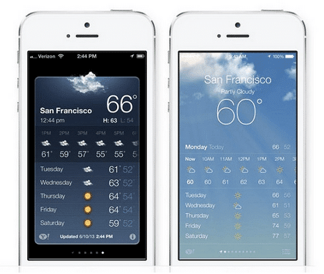
The Weather App on iOS 6 versus iOS 7
Simplification
Lots of apps are following this trend by offering narrowly focused tools, rather than feature-heavy products, which lends itself to a lighter UI. Users want their interface to get out of the way, and let the content stand alone.
Our Technology has Changed
Our devices just keep getting better- pixel density and screen dimensions improve with every new product generation, which means our design can be much more nuanced. Thinner, smaller typeface and tiny details can shine in a way they couldn’t before. And as we favor mobile devices, responsive design has led the charge in creating user-friendly, quick-loading pages. A flat, minimalistic design certainly lends itself well to that end.
Our Culture has Changed
In the early days of the web, controls needed to be obvious. The technology was new, and web designers emulated real life elements to help users feel more comfortable. As smartphones and tablets have permeated our culture, most users are familiar enough that subtle interface elements are viable options.
Minimalist Design Tips
Design elements are even more important without skeuomorphic tricks to lean on. As you pare down, you realize that the remaining elements have to be just right. It sounds simple, but it’s deceptively tough to get the balance right. Here are few fundamentals to start with.
1. Design Inspiration
Look to pre-PC sources (like architects, painters, or typographers) for design inspiration.
2. Check and Double Check
Check your designs on multiple devices. Colors, spacing, and other elements can look very different on different browsers and different devices.
3. Choose your Typeface Carefully
Sans-serifs are usually the best choice, although serifs can work in the right situation. Experiment with size and weight differences to create emphasis where you want in (headers, links, etc.), and make sure your final choice is easily legible.
A Serif and Sans-Serif Typeface used together can create interest
4. Interaction is Everything
While users are more likely to understand a subtle interface, it’s still important to indicate that certain elements are interactive. Conventional placement of common elements (like back buttons) do a lot to guide users. Staying within a sensible grid is another great way to help users make sense of their environment. Make sure you make it easy for users to correct mistakes as they navigate, and avoid layered elements like drop-down menus.
5. Edit, Edit, Edit
Continually ask yourself, “Is this element necessary?” If you think it isn’t necessary then you’re better off adopting minimalist web design. It’s so easy to hang on to an element you find especially clever, even if it’s unnecessary or even confusing. A great web designer can edit their work and be left with something more innovative and user-friendly.
In the end, there’s no hard-and-fast rules to get the right flat, minimalistic design. It’s the web designers job to create an intuitive, great-looking UI without sacrificing usability, and that requires different design elements for every project.
What do you think of the thin, flat design trend? Let us know in the comments.