By Jim Clanin
As the Internet continues to grow and evolve, so does design. The possibilities of the Internet have skyrocketed, and designers now have the opportunity to engage their audience and tell a story through design in a new and exciting way. In this blog post, we’ll go through the best ways designers can take their websites to the next level with the most popular eye-popping, jaw-dropping design trends.
Bigger is Better
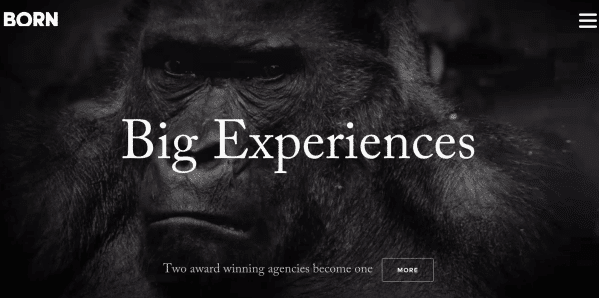
Full-screen images and slow moving video are used as a background with just a small amount of text in large font. This idea resembles movies and TV, creating a cinematic effect. This will make a big statement to your website visitors, and works really well for responsive design.
Parallax
Parallax effects have become pretty common as of late for websites who want to put on a show for users. The basic idea is that page scrolling or mouse movement is used to animate elements of the page. Parallax effects are usually best used sparingly, which provide a subtle element of depth to a website, but if done correctly, can be used to really wow the user by giving it a more prominent use on the website.
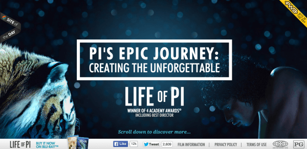
The website for The Life of Pi uses Parallax effects to the max and has several great examples of the options available. As you scroll from top to bottom, the main image looks like it’s moving up as to uncover the image below. As you continue to scroll, text and more images appear and disappear. Other images come to life with animation ignited by scrolling.
Scrolling Animation
New technologies such as HTML5 and CSS3 make it possible for designers to use scrolling animations to share a story or product in a more interactive and engaging way. If not used correctly, these effects can be gimmicky, but if used correctly, can create a fun and exciting experience for users. Check out the websites below for a couple of great examples of scrolling animation.
Borders Defied
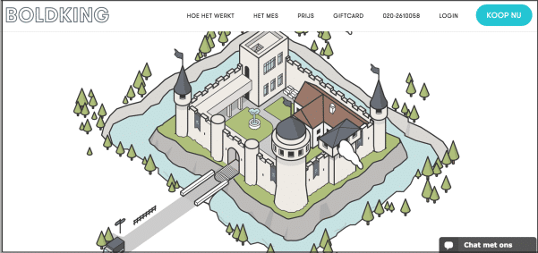
Most websites utilize, or you might say succumb to using rectangles for page layout. Many do so very nicely (as we’ll discuss below). However a new trend for top designers is to stretch their creativity to the max my completely defying the grid. These types of websites will the space with images, use diagonal lines and allow their design to be moved off the page.
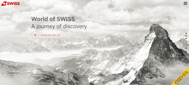 (also a great example of scrolling animation)
Split Screen
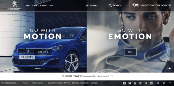
Split screens give companies the ability to feature two ideas, products, or some other type of visual at once. Usually matched up with the “bigger is better” idea, images or slow moving video is used as the background.
Block Grids
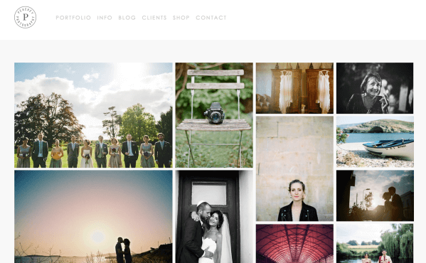
Block grids are used to display products and/or links to other pages that typically use images or bold colors as backgrounds. Grid structures can be of any size and shape. Some are very structured like a table with every row containing the same number of columns, each block displaying a different product or link. The example below is a little more complex with the number of columns and rows changing depending on how big your screen is or how far you zoom in or out. Block grid structures are also very effective in creating responsive websites because the blocks will stack on top of each other on a mobile device.
The Atlanta web design trends above are being used by companies who aspire to engage their audience and tell a story. However, they’re not for everyone. Whether you are looking to really wow your audience or are just looking for a few new ideas, we hope this blog post inspired you in some way. If you are looking for an Atlanta web design company, contact DoubleDome at (888) 799-6067!

